MOTION SOCIETY • BRAND IDENTITY
A brand system built to move with the club.
OVERVIEW
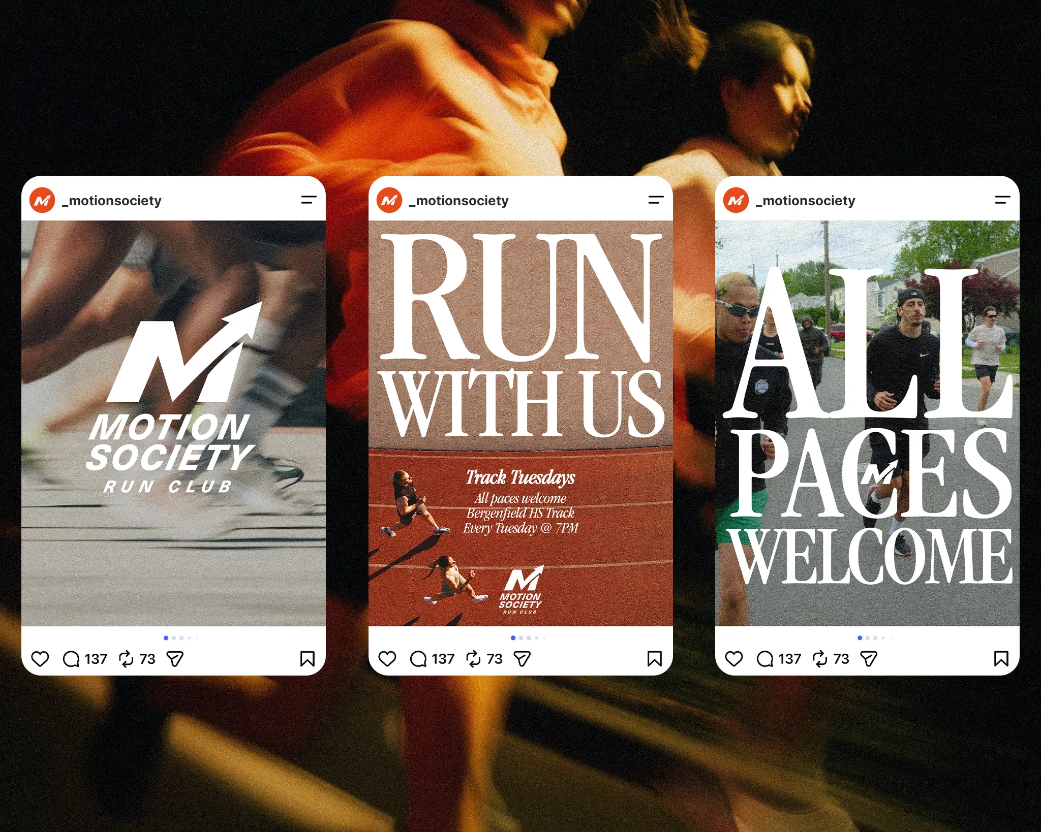
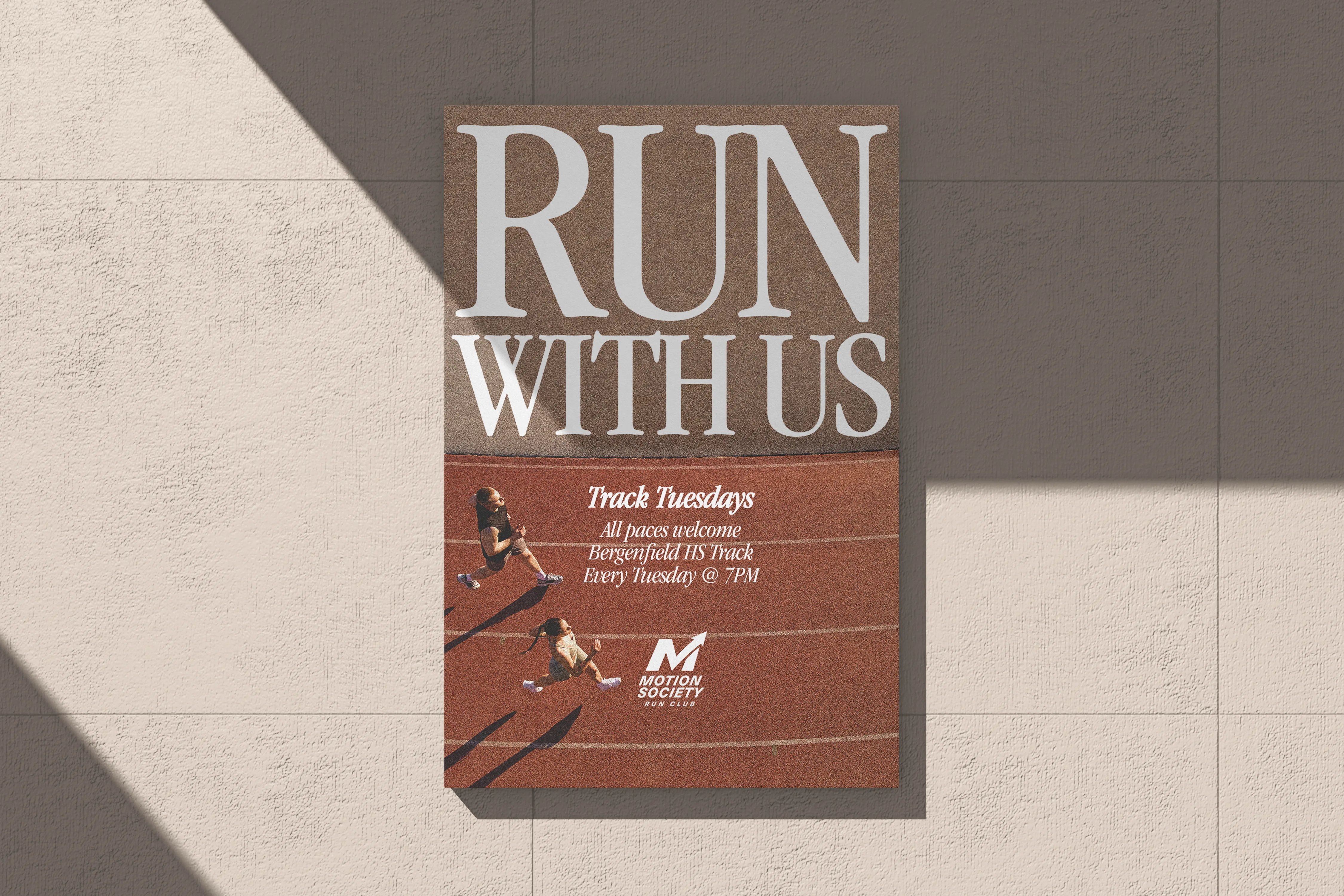
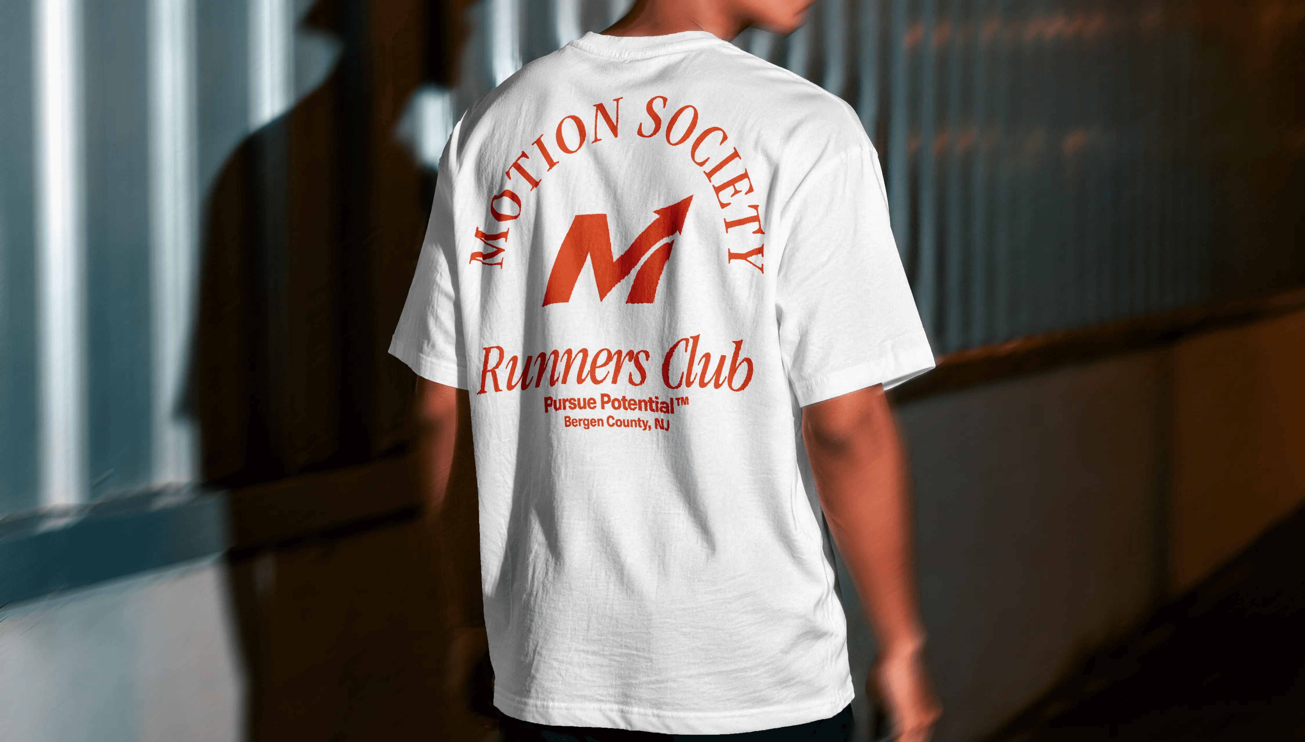
Motion Society is a run club based in Bergen County, New Jersey with weekly meetups. Motion Mondays has club members run at rotating locations, and Track Tuesdays at Bergenfield High School. All paces welcome.
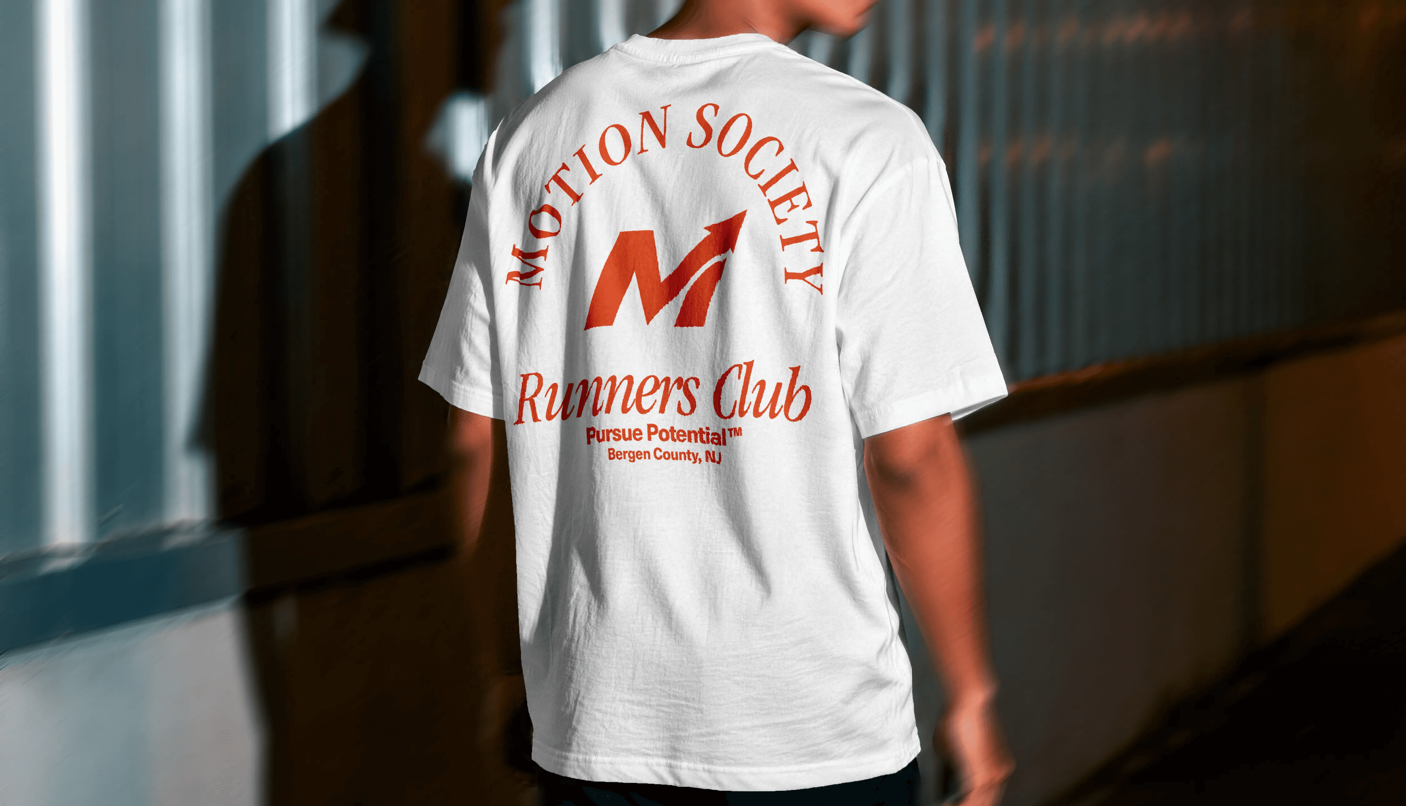
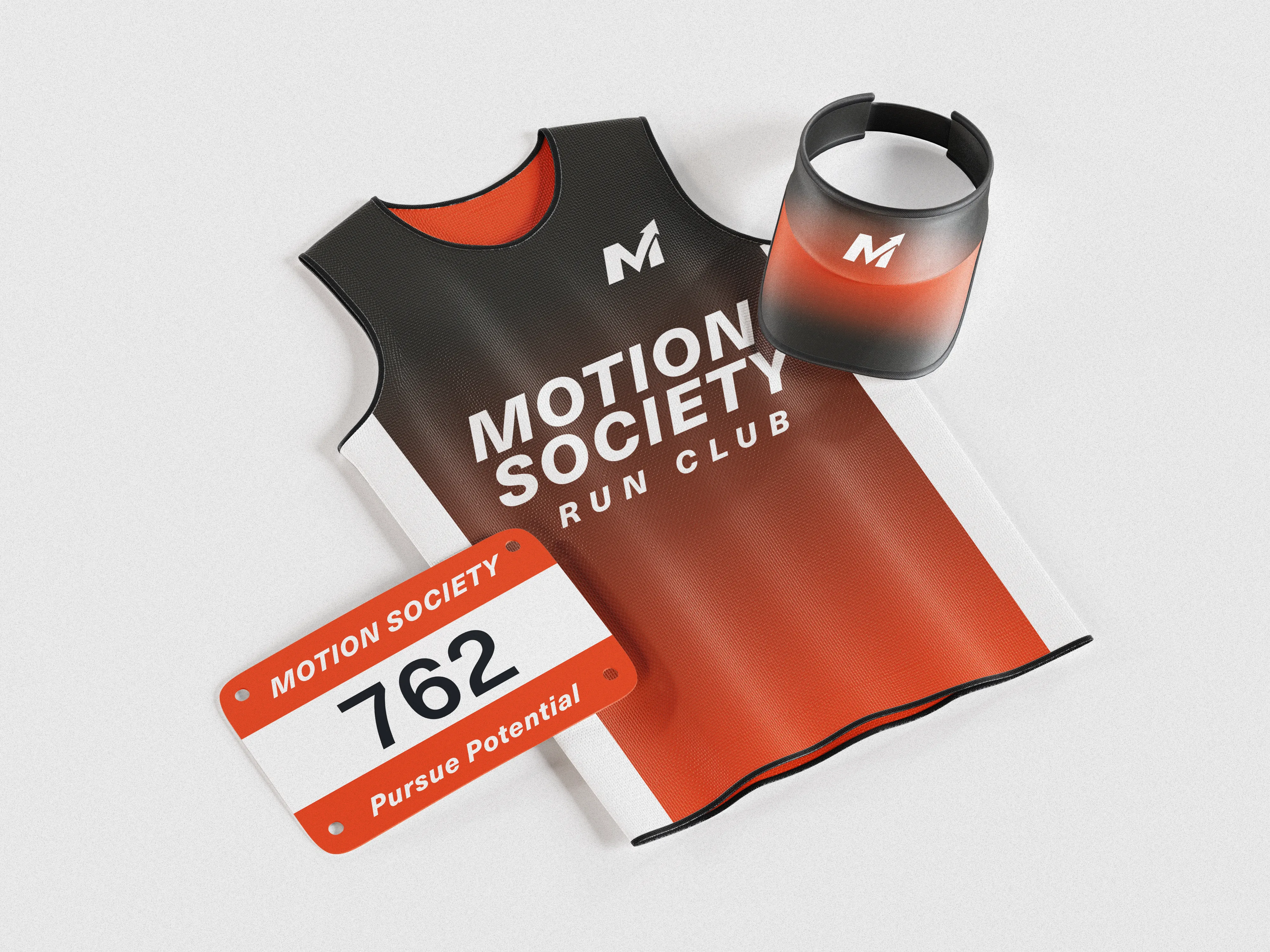
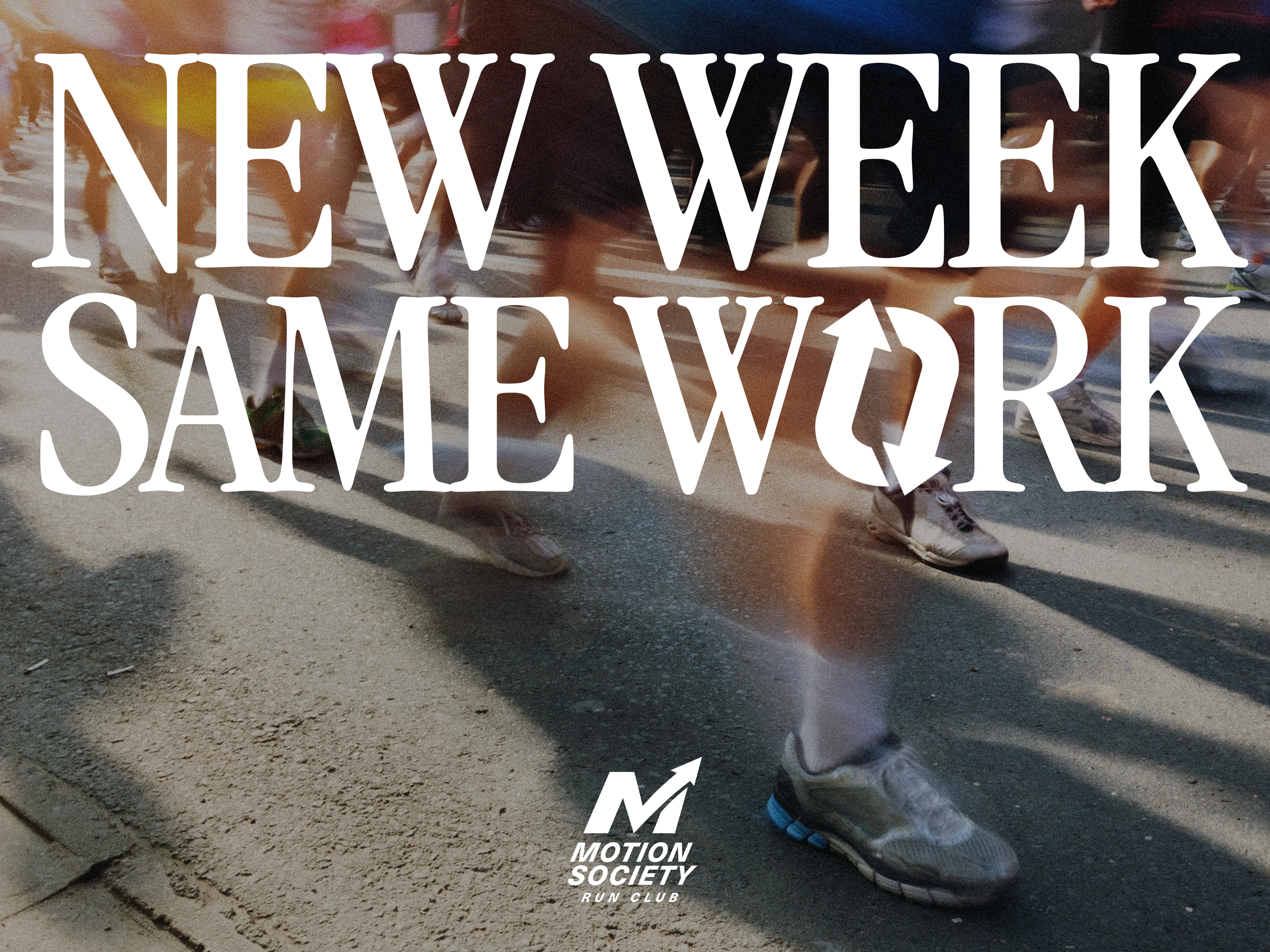
The club outgrew its original logo. A hand-drawn running figure worked great as an Instagram avatar but broke down in flyers, swag, accessories, merch, event signage. It needed a system, not just a mark.
TIMELINE
ROLE
TOOLS
SKILLS
Why it changed
The original logo was built for a circular avatar on social media. It needed to hold up when printed small, cut into merch, or scaled up on event posters. The rebuild needed to work everywhere the club actually shows up.

Original logo
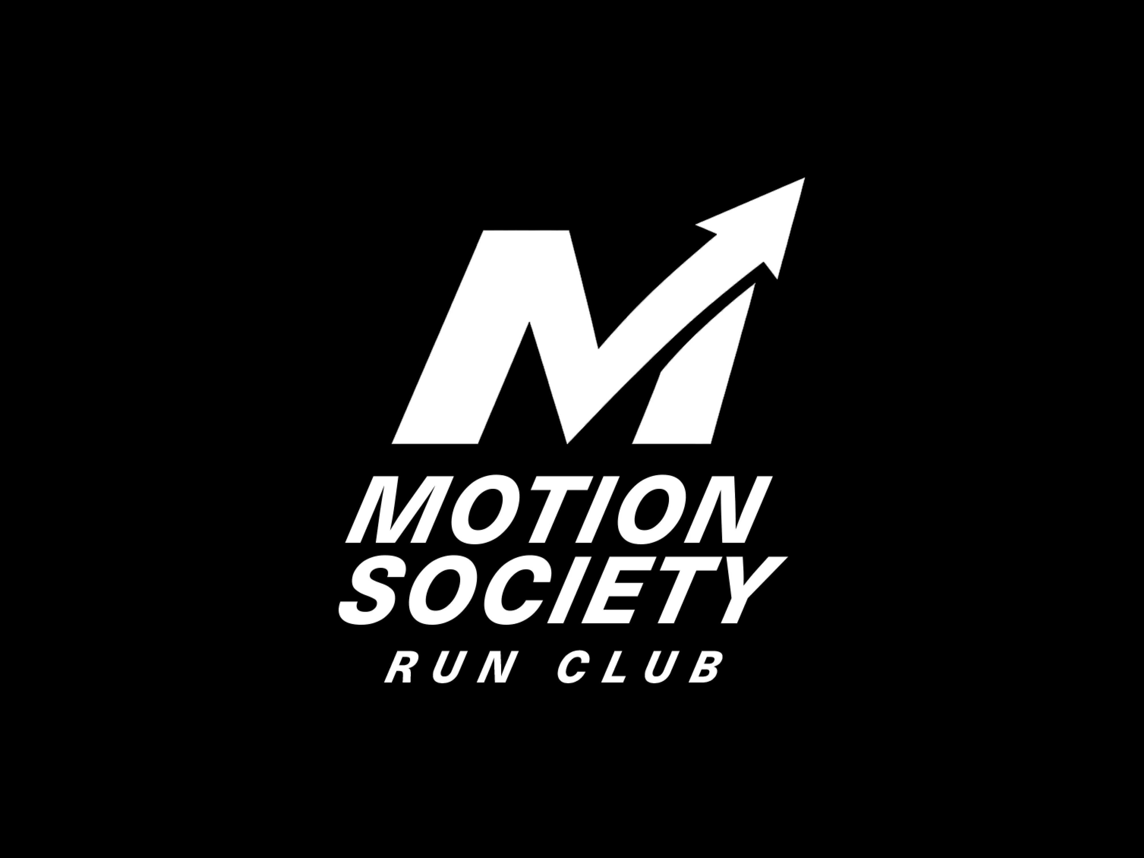
New logo
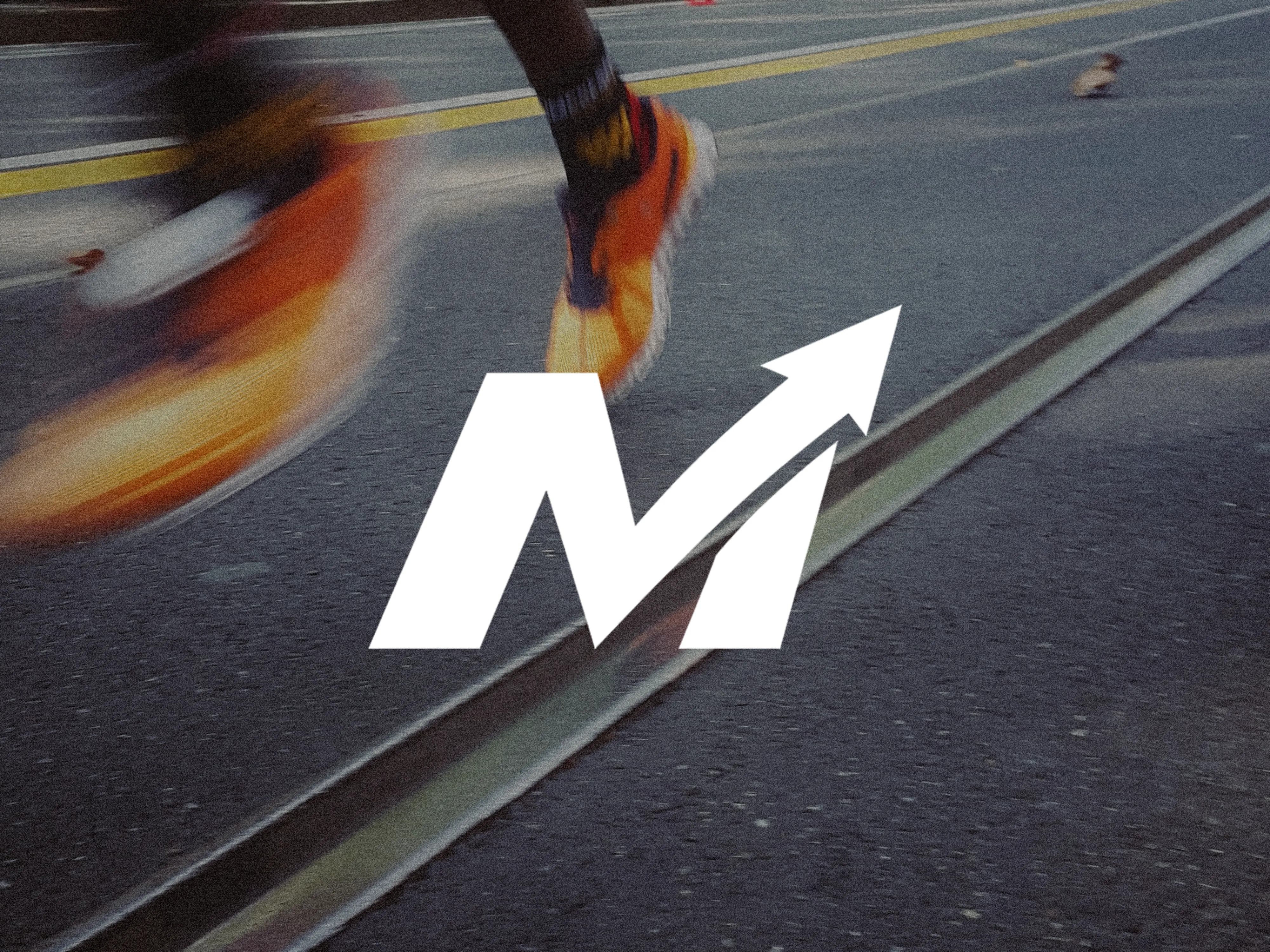
One shape, one idea
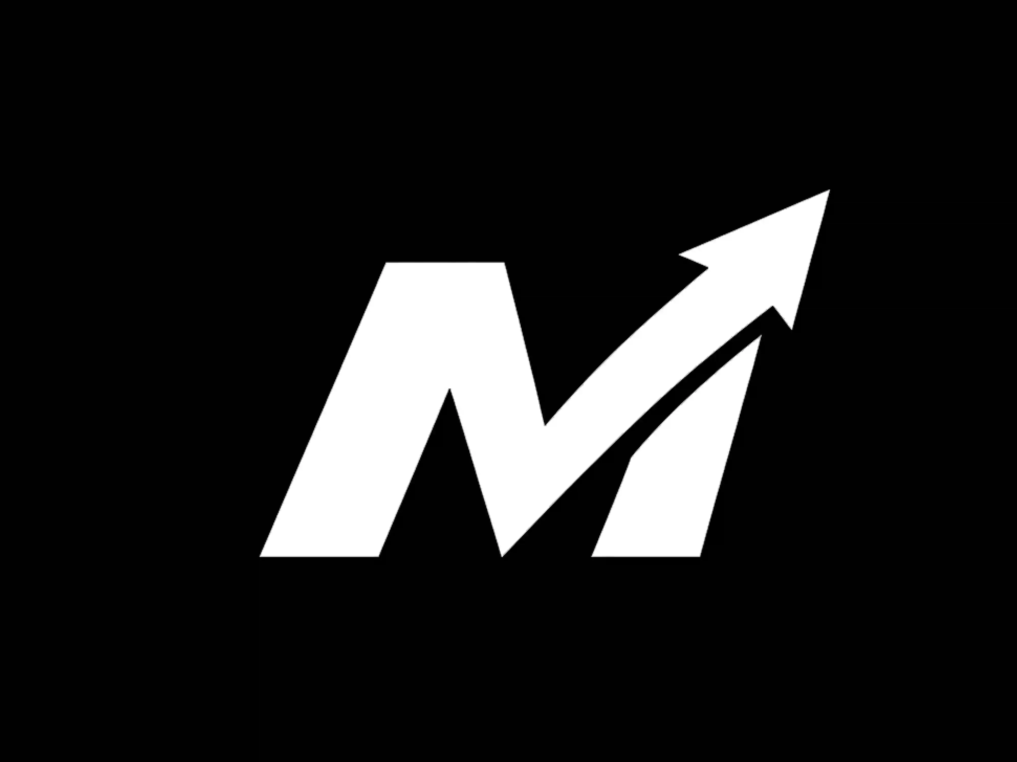
The M's right stroke is replaced by a single arrow, kicked upward past the letter's own height. No second element, no added icon.
Earlier versions had heavy drop shadows, repeating stripes, or motion-blur effects on the M. All of them added detail and did way too much. This version strips it back to a single confident stroke and makes it hold up at small sizes.
Off Black
Graphite
Burnt Red
Gray